Unavailable on this device access via a computer or laptop
Paulo Rogério Design
Visual Identity - Stage 4 Ascension
Rebrand Presentation
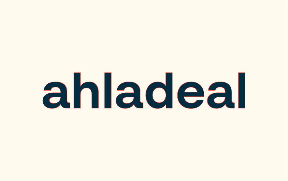
Project Ahladeal
contato@paulorogeriodesign.com
paulorogeriodesign.com
Paulo Rogério Design
Visual Identity - Stage 4 Ascension
Hello! Adam
A good brand is something truly captivating, but it rarely happens at first sight. Comparing it to a relationship, we can say that a good brand resembles more true love than overwhelming passion. Therefore, it’s crucial not to rush, neither approving it hastily nor rejecting it immediately.
Instant passion is often illusory when it comes to brands. When faced with a brand proposal, whether it’s a completely new rebrand from the original or an evolution of what already exists, it’s essential to take the time to “chew on it,” reflecting on its essence and potential.
To develop a genuine connection with this brand, imagine it in different scenarios and applied to everyday objects. Visualize it as a person. Ask yourself, “Do I like this person?”
You will notice that your initial perception, which may not have been the best initially, will transform over time.
Passion can arise when you least expect it.
contato@paulorogeriodesign.com
01
Paulo Rogério Design
Visual Identity - Stage 4 Ascension
Goals from
the project
Identifying the key characteristics that make Nome who it is, developing a clear personality, and transforming these attributes into visual elements.
Facilitating and standardizing the use of the brand in printed materials and digital presentations, aiming for practicality in everyday use.
Develop a brand that communicates more effectively with the target audience and also an identity system that establishes itself in the market quickly.
contato@paulorogeriodesign.com
02
Paulo Rogério Design
Visual Identity - Stage 4 Ascension
Brand Plataform
Diagnosis and Personality
contato@paulorogeriodesign.com
03
Paulo Rogério Design
Visual Identity - Stage 4 Ascension
Simplified positioning
Ahladeal is a marketing and advertising agency with 20 years of experience, committed to simplifying the lives of entrepreneurs. We offer complete solutions, from brand creation to printing and marketing strategies, all wrapped in effective communication.
We believe in the financial independence of our clients, providing them with the freedom to focus on what they love while we take care of their online presence, advertising, and communication.
Our mission is to be the trusted partner that makes branding, advertising, marketing, and communication accessible and effective for all those seeking success in business.
contato@paulorogeriodesign.com
04
Paulo Rogério Design
Visual Identity - Stage 4 Ascension
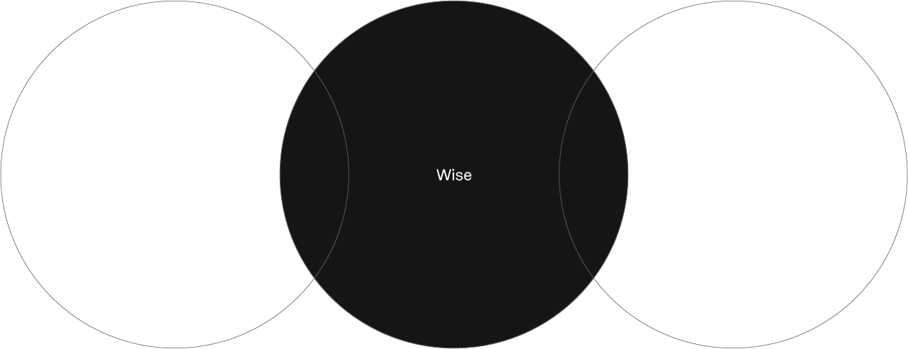
Proprietary Attributes
You know that person you meet and can immediately tell what their personality is like? With brands, it’s no different! Each brand has a unique personality, a way of presenting itself to the public, and its own language.
That’s why it’s essential to map out the brand’s attributes to show the world who the brand truly is. Below, we will present a chart that illustrates these characteristics of Ahladeal, from the most important to the less important but still relevant.
Take a look!
contato@paulorogeriodesign.com
05
Paulo Rogério Design
Visual Identity - Stage 4 Ascension
Ahladeal is:
contato@paulorogeriodesign.com
06
Paulo Rogério Design
Visual Identity - Stage 4 Ascension
Ahladeal is not:
contato@paulorogeriodesign.com
07
Paulo Rogério Design
Visual Identity - Stage 4 Ascension
Why?
How?
What?
The company’s purpose is to be the trusted partner that makes branding, advertising, marketing, and communication accessible and effective for everyone seeking success in business.
Providing customer service that makes clients feel comfortable and confident in advertising services.
Creating a sense of closeness, trust, simplicity, and lightness.
Humanized communication is the biggest differentiator.
AhlaDeal takes care of online presence, advertising, marketing, and communication. Operating from the beginning of new businesses, developing brands, advertising campaigns, and communication strategies.
contato@paulorogeriodesign.com
08
Paulo Rogério Design
Visual Identity - Stage 4 Ascension
“They may even forget what
you said but you will never forget
how did you do it."
contato@paulorogeriodesign.com
09
Paulo Rogério Design
Visual Identity - Stage 4 Ascension
Target audience & competitors
Who does Ahaladeal want to serve?
contato@paulorogeriodesign.com
10
Paulo Rogério Design
Visual Identity - Stage 4 Ascension
Who are they?
The target audience in question consists of entrepreneurs who have opened their own businesses and are looking to attract new customers.
They face challenges on this journey and often aren’t aware that they need assistance. Their primary motivation is to achieve financial independence while pursuing what they love. The solution that Ahladeal offers aims to simplify their lives, allowing them to focus on their areas of expertise while the team takes care of branding, advertising, and marketing strategies.
contato@paulorogeriodesign.com
11
Paulo Rogério Design
Visual Identity - Stage 4 Ascension
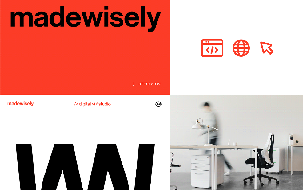
The Digital Boutique
Here are some initial drafts that were developed during the early phase of the project. Reviewing these drafts can provide a deeper understanding of the evolution of the idea behind the symbol.
Color palette:
contato@paulorogeriodesign.com
12
Paulo Rogério Design
Visual Identity - Stage 4 Ascension
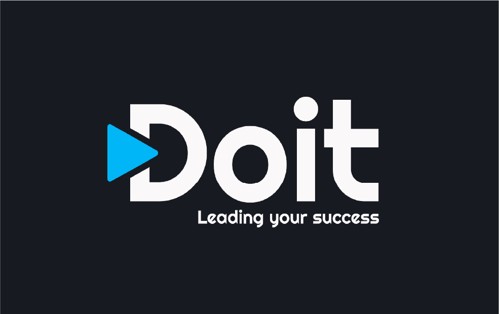
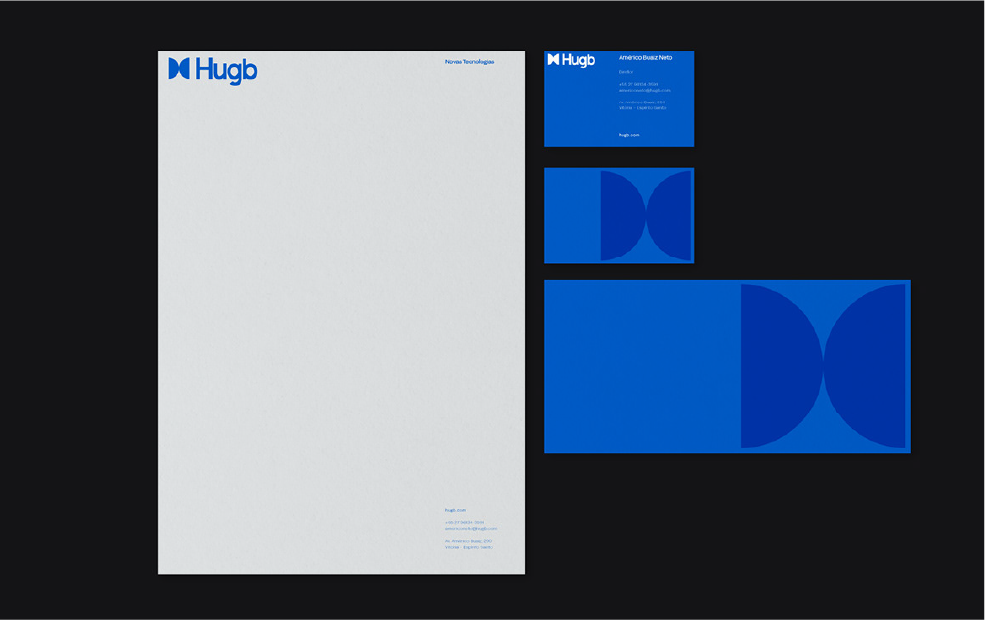
Doit
Unlike The Digital Boutique, Doit has a rather conventional logo and uses a standardized secondary typography across all its communication channels. However, there are areas that need improvement:
Its photographic style relies on free .png images, compromising the quality and visual impact of the brand. Graphic elements lack a coherent visual identity. The color palette lacks harmony, especially in the shade of blue (the predominant color of the brand), creating a sense of disorder and confusion.
In summary, Doit lacks a cohesive and effective visual identity.
Color palette:
contato@paulorogeriodesign.com
13
Paulo Rogério Design
Visual Identity - Stage 4 Ascension
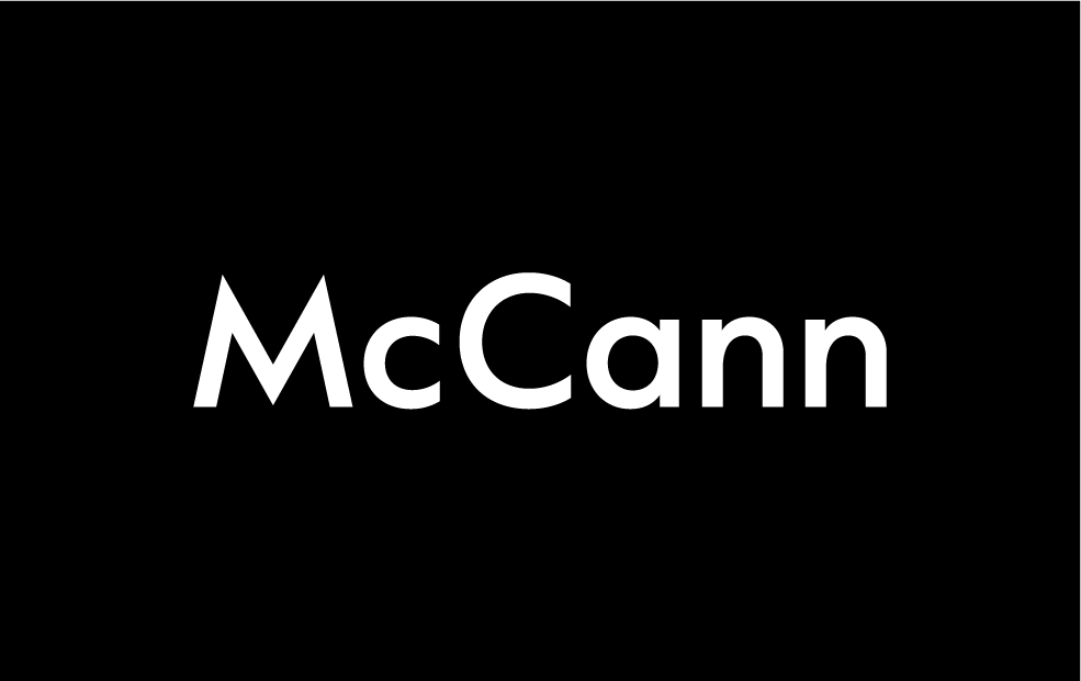
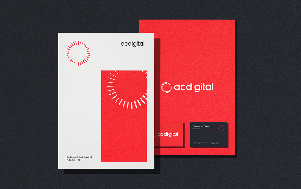
McCann
The brand showcases versatility through its simplicity, and the 3D elements used on its website are of high quality.
The photographic style is consistent and reflects some of the brand’s personality, featuring warmer tones and slight saturation. However, there is inconsistency in the brand’s color palette. On the website, black is used as the primary color, while in other touchpoints, such as social media, blue is employed as the primary color.
In summary, McCann doesn’t present many visual issues and performs well in terms of brand consistency across touchpoints.
Paleta de cores:
contato@paulorogeriodesign.com
14
Paulo Rogério Design
Visual Identity - Stage 4 Ascension
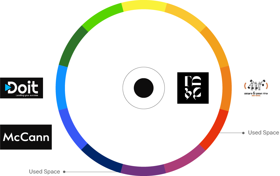
Colors in the Scenary
In the chart on the side, we can observe the distribution of colors used by competitors in the market and opportunities to stand out with a different visual identity.
contato@paulorogeriodesign.com
15
Paulo Rogério Design
Visual Identity - Stage 4 Ascension
Moodboard
Reference images for creation
contato@paulorogeriodesign.com
16
The time has come to discover the new phase of Ahladeal
Paulo Rogério Design
Visual Identity - Stage 4 Ascension
Drafts
Here are some initial drafts that were developed during the early phase of the project. Reviewing these drafts can provide a deeper understanding of the evolution of the idea behind the symbol.
contato@paulorogeriodesign.com
20
Paulo Rogério Design
Visual Identity - Stage 4 Ascension
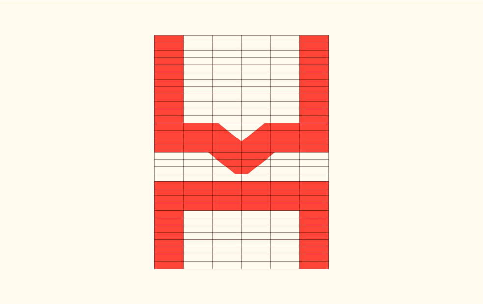
Symbol and icon
The new symbol of Ahladeal was created to represent the essence of the brand: a foundation for communication.
The letter “h” from the old symbol was retained, but a triangle was added to the top of the symbol to represent a speech bubble. This symbolizes communication, which is one of the company’s core attributes.
The bottom of the symbol represents a foundation. This symbolizes the strength and stability of the company, which provides solid support for its clients. The symbol was constructed using a rectangular grid with a subdivision of 6×32.
contato@paulorogeriodesign.com
20
Paulo Rogério Design
Visual Identity - Stage 4 Ascension
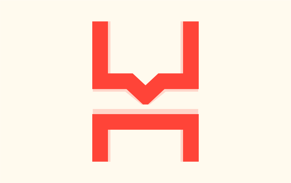
Optical Adjustments
The symbol was designed with a minimalist design, making it versatile and easy to reproduce. This makes the brand memorable and accessible to a wide audience.
The bevels and straight shapes of the symbol convey a sense of strength and maturity. This reinforces the credibility of the company and its experience in the market.
Optical adjustments were made in the refinement and review phase to make the viewing of the new brand even more pleasant.
Adjustments:
contato@paulorogeriodesign.com
21
Paulo Rogério Design
Visual Identity - Stage 4 Ascension
Typography
BR Sonoma is a new geometric grotesque built for the 21st century with a finely tuned modern aesthetic. BR Sonoma builds on the foundations laid by the classic Swiss grotesques such as Helvetica and Univers but combines their features with a stronger geometric base usually found in other early classics such as Avant Garde, Futura and Avenir.
Designer: Christoph York
Publisher: Brink
Foundry: Brink
contato@paulorogeriodesign.com
22
Paulo Rogério Design
Visual Identity - Stage 4 Ascension
Optical Adjustments
During the brand refinement phase, small adjustments were made to the strokes and curves of the typography to enhance weight distribution and improve legibility.
Adjustments:
contato@paulorogeriodesign.com
23
Paulo Rogério Design
Visual Identity - Stage 4 Ascension
Standard Logo
This is the final outcome of the brand after meticulous refinement and optimization. Throughout this process, we conducted a series of legibility and reduction tests, and the brand exhibited remarkable performance, proving to be highly versatile and user-friendly.
contato@paulorogeriodesign.com
24
Paulo Rogério Design
Visual Identity - Stage 4 Ascension
Supporting typography
Archivo is a grotesque sans serif typeface family originally designed for highlights and headlines. This family is reminiscent of late nineteenth century American typefaces. The technical and aesthetic characteristics of the font are both crafted for high performance typography. It was designed to be used simultaneously in print and online platforms and supports over 200 world languages.
Archivo has been upgraded to a variable font in 2021. The weight and width axes allow a wide variety of styles, from Thin to Black and from ExtraCondensed to Expanded.
contato@paulorogeriodesign.com
24
Paulo Rogério Design
Visual Identity - Stage 4 Ascension
Graphics System
Components of
brand identity
contato@paulorogeriodesign.com
26
Paulo Rogério Design
Visual Identity - Stage 4 Ascension
Color Pallette
We chose to keep the original brand colors, but now we adapted them using PANTONE palettes as a reference. This choice aims to streamline everyday graphic design work. Furthermore, we revitalized the shades to give the brand a distinctive edge in the market and a more contemporary appearance.
contato@paulorogeriodesign.com
28
Paulo Rogério Design
Visual Identity - Stage 4 Ascension
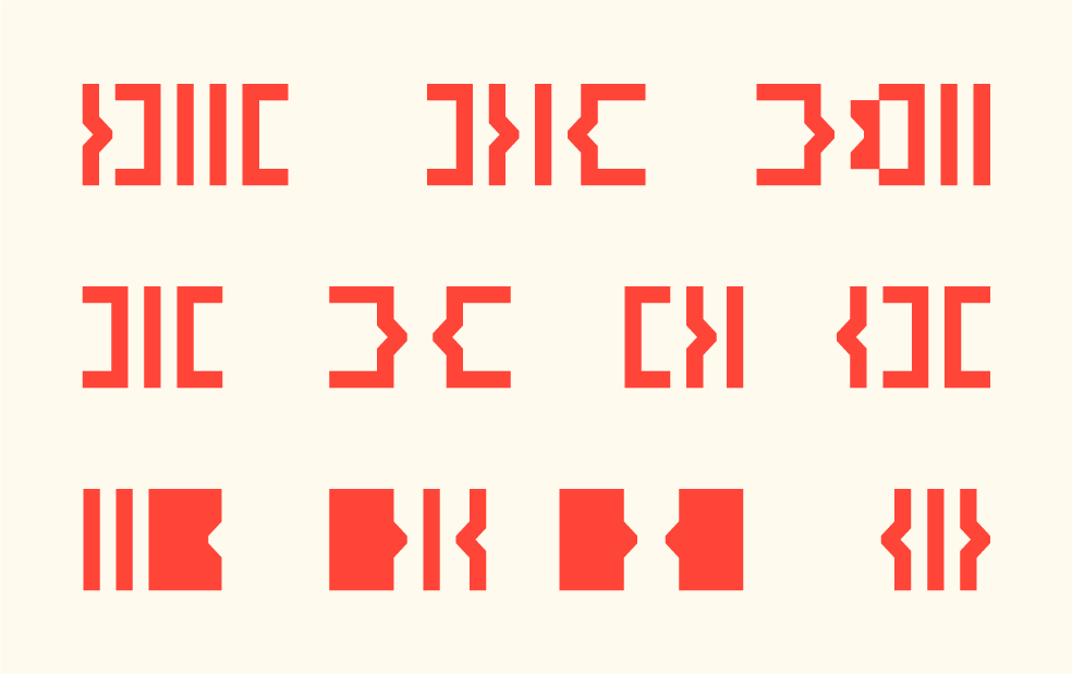
Variable Elements
From the symbol, we have developed an extremely versatile graphic system with eight adaptable and easily manageable pieces.
Even with so many variations, the system remains easily identifiable and can effectively replace the symbol when it comes to brand recognition. It also makes the design of various pieces much easier.
contato@paulorogeriodesign.com
29
Paulo Rogério Design
Visual Identity - Stage 4 Ascension
Applied techniques
Theory behind from the project
contato@paulorogeriodesign.com
30
Minimalism
The more complex the design, the more it harms your business.
This is because simplicity generates a better first impression and makes understanding and using an interface easier. In building a brand, minimalism has been prevalent in recent years and will continue to be so for some time.
They say that a great logo can be recreated by hand and from memory. In other words, it needs to be simple enough to be recognized, memorized, remembered, and easily reproduced. Following this principle, minimalism in logos is a trend that reaffirms itself year after year.
However, just because something is simple doesn’t mean it’s easy. In fact, many designers find that the more minimalist, the more challenging it is to create a good logo. This is because the fewer elements there are, the harder it is to impress and convey a message.
Gestalt
Gestalt is the study of human perception in relation to shapes, the existence of patterns of visual behavior that humans exhibit. These patterns form the basis for the Laws of Gestalt.
This science argues that in order to understand the parts of a shape, it’s necessary to first comprehend the whole that surrounds and composes it. In other words, we could say that Gestalt studies how our brain perceives shapes. We could translate Gestalt as ‘The Psychology of Forms.’ It understands that our perception of things occurs as a unified whole, not as isolated points.
This brain regulation is spontaneous. We can’t control it. When our brain sees a shape, it tries to relate the information to something we’ve seen in the past and stored in our memory. So, the Gestalt theory tells us that only through the perception of a whole can the brain interpret and assimilate a shape or concept.
Paulo Rogério Design
Visual Identity - Stage 4 Ascension
Aplications
Brand developments
contato@paulorogeriodesign.com
33
Paulo Rogério Design
Visual Identity - Stage 4 Ascension
Observation
important
The mockups of the following pages are purely illustrative images, intended solely to demonstrate the graphic system and visual identity functioning in contextualized elements that bring the brand into the ‘real world.’
None of the images can be considered final pieces or closed layouts, as each supplier or company responsible for producing each item has its limitations in graphic processes or materials.
34
Paulo Rogério Design
Visual Identity - Stage 4 Ascension
Thanks for getting this far!
Design by: Paulo Rogério
Motion by: Marcos Rodrigo